

|
|
|
The web pages in RAMADDA are created through its wiki facility. The wiki facility supports both regular wiki markup like Wikipedia uses
as well as special RAMADDA wiki tags that allow for page payout, displaying maps, lists, charts, etc.
|
==Section Heading 1==
===Section Heading 2===
A horizontal line:
----Bulleted lists:
* bullet 1
* bullet 2
** sub bullet 1
** sub bullet 2
* bullet 3
The RAMADDA wiki text supports a number of other markup methods using +tag/-tag and :tag syntax. The "+/-" syntax is for multi-line and the ":" syntax is for single line. For example, an easy way to add a line break of paragraph (instead of doing <br>, <p>) is:
:br
:pr
To center text do:
+center
some text
to center
-center
To wrap text in a div do:
+div
...
-div
Set the background color or image with:
+div color="color"
...
-div

+div image=image_reference
...
-div

+div style="css style"
...
-div
Where image_reference is either:
+div image=::name_of_attachment
-div
+div image=this
...
-div
+div image=other_entry_id
...
-div
To add attributes to the div do:
+div style="max-height:100px;overflow-y:auto;"
...
-div
To create a button do:
:button /url Some label
:button-green /url Some label
:button-blue /url Some label
Will produce: Some label
Some wiki text
<nowiki>
This is text that does not get formatted
</nowiki>
more wiki text
For example, if you want to include javascript in your text do:
<nowiki>
<script  type="text/JavaScript"  >
...
</script>
</nowiki>
:macro macro_name macro body
or:
+macro macro_name
macro
body
-macro
To use the macro do:
:macro macro_name Some text
...
any wiki text here ${macro_name} more text
For example, if you have a number of buttons as described above but want to have
one color for them do:
:macro buttonColor -green
...
:button${buttonColor} /url1 Button 1 text

:button${buttonColor} /url2 Button 2 text
Repository wide macros can be defined in the server side properties file in the RAMADDA home directory. Add the below properties:
ramadda.wiki.macros=comma separated list of macro names
ramadda.wiki.macro.<macro>=<macro value>
#For example
ramadda.wiki.macros=buttonColor,blockColor
ramadda.wiki.macro.buttonColor-green
ramadda.wiki.macro.blockColor-olivine
Note: the block tag below has a similar feature with the "var" attribute. The difference is that the block tag can be placed at the bottom of the page after the var that it references is used. The macro tags need to be inline before they are used.
You can specify the toggle label title with:<block> any content here </block>
<block title="Click here to open">
 any content here
</block>
<block open="false">
 any content here
</block>
You can also use the block tag to define a variable or macro that is used later.<block show="mobile" decorate="false"> this will only show for mobile users </block> <block show="!mobile" decorate="false"> this will only show for non-mobile users </block>
<block var="var_name">
 any content here
</block>
${var_name}
One line forms:
:title Some title
:heading Some heading
:blurb Some blurb
:note Some note
:block A block

Multi line forms:
+note
Some lengthy text
and more
-note
You can change the background color with:
:blurb-green Some green background
:note-rose Rose colored background
Examples at https://ramadda.org/repository/alias/wikiexamples.
+section
section content
-section
If you append a "#" then the row number is kept track of and an even/odd color scheme is applied.
+section  #
...
-section
+section  #
...
-section
If you append a "----" then a top border is shown:
+section
...
-section
+section  ----
...
-section
If you add title="..." then a title is added. If you add label="..." then a header is added. The normal use is:
+section # title="section 1"
...
-section
+section # label="section 2"
...
-section
+section # label="section 3"
...
-section
Using the {
+section  title={{name}}
...
-section
You can change the background color/image by specifying sections as below. Full list of styles here.
+section class="ramadda-section-map"
...
-section
+section class="ramadda-section-lightpink"
...
-section
+section class="ramadda-section-lightblue"
...
-section
+section class="ramadda-section-lightgreen"
...
-section
You can also add a CSS style descriptor
+section style="background: #888; border: 1px red solid;"
...
-section
+inset
...
-inset
This by default gives a 20px left and right margin. To change this you can add any of the attributes, e.g:
+inset top="100" left="50" right="50" bottom="100"
...
-inset
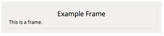
+frame
content
-frame
You can change the background of the inner part of the frame with:
+frame background=white
content
-frame
You can change the size and the color of the frame with:
+frame frameSize=5 frameColor=red
content
-frame
Add a shadow effect with
+frame background=#fff frameSize=0 shadow
content
-frame
@(https://twitter.com/Interior/status/463440424141459456)

@(https://vimeo.com/515404225k)

@(https://www.youtube.com/watch?v=BGaCjM2hal4)

@(https://www.facebook.com/don.murray.121/posts/10219628323639292)
Set dimensions on videos:
@(https://vimeo.com/515404225 width=300 height=200)

@(https://www.youtube.com/watch?v=BGaCjM2hal4 width=300 height=200)
Add a style to the embed:
@(https://vimeo.com/515404225 width=300 height=200 link=true label="Click here" style="display:block;background:red;margin:20px;")Add a link to the embed:
@(https://www.youtube.com/watch?v=BGaCjM2hal4 width=300 height=200 start=600 link=true label="Click here")Embed Github checkins with:
@(github user=some_user_name)

#or a repository
@(github owner=repository_owner repository=repository)

#don't show avatar image
@(github owner=repository_owner repository=repository decorate=false)
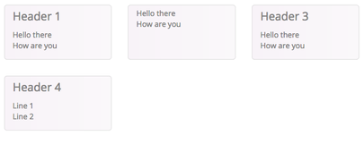
+gridboxes-<number of columns>
+gridbox Header 1
contents
-gridbox
+gridbox Header 2
contents
-gridbox
-gridboxes
For example:
+gridboxes-3
+gridbox Header 1
Hello there


How are you
-gridbox
+gridbox
Hello there


How are you
-gridbox
+gridbox Header 3
Hello there


How are you
-gridbox
+gridbox Header 4
Line 1
:br
Line 2
-gridbox
-gridboxes
+table  height=100  stripe=false hover=true searching=false  cellborder=false rowborder=false paging=false ordering=false
+tr
+td
heading 1
-td
+td
heading 2
-td
-tr
+tr
+td
column 1
-td
+td
column 2
-td
-tr
...
-table
The attributes of the +table tag are all optional.
+table  height=100
:tr "heading 1" "heading 2"
+tr
:td column 1
:td column 2
-trow
...
-table
Here are three equally spaced columns:
+row
+col-4
Left column contents
-col
+col-4
Center column contents
-col
+col-4
Right column contents
-col
-row
Which results in:
You can set the widths of different columns:
+row
+col-2
Left column contents
-col
+col-10
Right column contents
-col
-row
Which results in:
+tabs
+tab Tab 1 title
Tab 1 content
-tab
+tab Tab 2 title
Tab 2 content
-tab
...
+tab Tab N title
Tab N content
-tab
-tabs
Tabs can also be nested:
+tabs
+tab Tab 1 title
+tabs
+tab another tab title
...
-tab
-tabs
-tab
+tab Tab 2 title
Tab 2 content
-tab
-tabs
Use a minimal style:
+tabs min
+tab Tab 1 title
+tabs
-tabs
Use a minimal style with arrows:
+tabs minarrow
+tab Tab 1 title
+tabs
-tabs
Center the tabs:
+tabs center
+tab Tab 1 title
+tabs
-tabs
+accordion heightStyle="auto|fill|content" animate="number of milliseconds" collapsible="true|false" activeSegment="segment number of active segment (0 based)" decorate="true|false"
+segment Accordion 1 Title
Accordion 1 content
-segment
+segment Accordion 2 Title
Accordion 2 content
-segment
-accordion
If decorate=false then no border or background is shown for the headers.
+note
This is the snippet
-note

or:
+callout-info
This is the snippet
-callout
...
...
<snippet>
This is the snippet
</snippet>
...
...
<snippet-hide>
The snippet
</snippet>
...