
|
|
|
RAMADDA provides a number of information and data display components in the wiki facility.
There are a number of
examples available. An easy way to figure out what is going on is to the the wiki text of working examples. The wikitext used for any RAMADDA entry can be viewed with the Menu->View->Information page -
example.
|
{{display_<display type> <name=value pairs>}}
Each of these tags support the following attributes:
layoutHere="true"
showMenu="true"
showTitle="true"
title="Title to display"
If layoutHere is set to false then the component is laid out by the container group (below). Otherwise it is displayed in place.
{{display_linechart entry="some other entry id"}}
The data can also come form an entry on a different RAMADDA using the remote attribute:
{{display_linechart remote="https://ramadda.org/repository/entry/show?entryid=0c4338b6-1469-48ec-88b4-406f61621420"}}
The data that is displayed takes the form of a number of records where each record is composed of the same number
of fields. Optionally, records can also have a latitude/longitude position and a date associated with them.
The data for an entry is a JSON format and is accessed via the URL, e.g.:
{{display_linechart max=20000}}
If you have a number of displays on one page that you want to apply the same max value for then use:
{{property max=20000}}
{{display_linechart}}
{{display_table}}
You can specify a stride with the "skip" attribute. For example if you want to fetch every other record do:
{{display_linechart skip=1}}
Every 10th record do:
{{display_linechart skip=10}}
If you only wanted the last N records specify, e.g.:
{{display_linechart lastRecords=10}}
You can also specify a start and end date range with:
{{display_linechart startDate="yyyy-MM-dd HH:mm" endDate="yyyy-MM-dd HH:mm"}}
e.g.:
{{display_linechart startDate="2021-01-01"}}
The startDate and endDate can also be relative to the current date. For example, if you wanted to get the last week's data you would do:
{{display_linechart startDate="-1 week"}}
In general the relative dates take the form:
<offset> <dateunit>
where:
dateunit=second|minute|hour|day|week|month|year|century|millenium
For example:
{{display_linechart startDate="-13 days" endDate="-5 days"}}
{{display_timeline
doEntries=true
imageField="image"
textTemplate="${description}"
}}
The data fields that are created for the entries are:
id
name
description
id
typeid
type
start_date
end_date
create_date
icon
entry_url
thumbnail
image
file_url
latitude
longitude
elevation
fields="active_voters,total_ballots"
Or:
fields="1,#2,#3"
The field ids for a point data entry can be viewed with the Metadata view, e.g. - (example).
{{display_linechart fields="#5,#6,#7,#8,#9,#10" }}
+row
+col-3
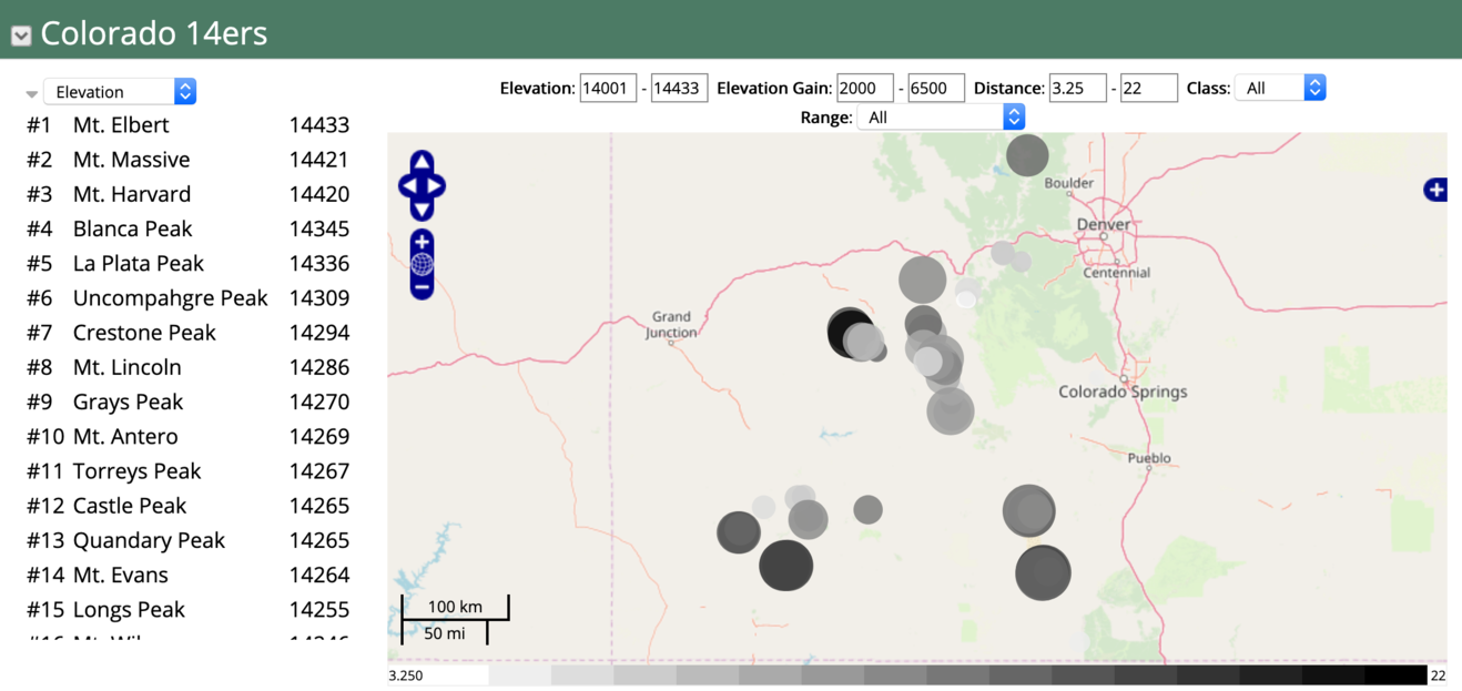
{{display type="ranking"
...
filterFields="elev,elev_gain,distance,range,class" hideFilterWidget=true
}}
-col
+col-9
{{display type="map"
...
filterFields="elev,elev_gain,distance,class,range"
}}
-col
-row
Filter attributes:
convertData="command1;command2;...;"

Where commands can be:
  derived(field=field_id, function=some_expression)
e.g.:
  derived(field=poptimes10, function=population*10)

  rotateData(includeFields=true,includeDate=true,flipColumns=true)
  addPercentIncrease(replaceValues=false)
By date:
startDate="yyyy-MM-dd"
endDate="yyyy-MM-dd"

By value:
dataFilters="command(field=<field id>,value=<value>,enabled=<value>,label=<label>...


Where "command" can be one of:
match - string match
notmatch - string not match
lessthan - <=
greaterthan - >=
equals
notequals


If the label is specified then a selector checkbox will be shown to turn on/off this filter
You can also sample the data with:
stride=1 -  take every other point
maxDisplayedPoints= - if set, then set the stride so we at most have  maxDisplayedPoints points
You can bin the data based on dates with:
binDate=day|week|month|year
binType=total|count|average
Only show unique rows with:
uniqueField=<field id>
colorTable="some color table name" - specify the color table

colorTable="colors:red,green,blue,...."   - explicit list of colors

colorTable.<field name> ="some color table"  - specify a color table for one of the "color by" fields

colorTableInverse="true"   -reverse the colors

colorTableAlpha="0.0 - 1.0" - specify a transparency value

colorBy=<field name> - specify a data field to color by

colorByFields=<field1,field2,...,fieldN> - specify a number of fields to allow the user to choose how to color
{{group group 1 ...}}
{{display display 1}}
{{display display 2}}
{{display display 3}}
{{group group 2...}}
{{display display 4}}
{{display display 5}}
If showMenu is set to true for a group then the below menu is displayed.
This supports the interactive creation of new charts and displays. The layout of these
displays can be changed interactively, their state can be changed and they can be deleted.
If the user is logged in then the set of dynamically created displays can
be saved (e.g., as a wiki page)
through the group menu as seen below:
layoutType=tabs
layoutType=table
layoutType=columns
layoutType=rows
Using the table layout the number of columns is specified with the layoutColumns attribute. For the columns and rows layout type each child display can specify the column number of row number it should be placed in. For example, for the rows layout if you had:
{{group layoutType="rows"}}
{{display display1  row="1"}}
{{display display2  row="1"}}
{{display display3  row="1"}}
{{display display4  row="2"}}
{{display display5  row="2"}}
{{display display6  row="3"}}
Would result in (without the border):
| display1 | display2 | display3 |
| display4 | display5 |
| display6 |
The divid attribute allows you to specify a div tag that is in the wiki page as the location for the group and the displays to place themselves in. For example, below is the (abbreviated) wiki text used to create this page on ramadda.org. We want to have a fixed layout where the entry list is on the left and the map is on the right. Any charts or other display components that are interactively created by the user are managed by the group and layed out below the list and map. To do this we define a regular html table layout that contains a couple of div tags - one for the list and one for the map. We set the IDs of the div tags and then reference those IDs in the display wiki tags below. Likewise, the group has a divid=maindiv which corresponds to the div at the bottom of the page.
<table width=100% border=0 cellpadding=10>
<tr valign=top>
<td width=50%><div id="listdiv"></div></td>
<td width=50%><div id="mapdiv"></div></td>
</table>

<div id=maindiv></div>
{<noop>{group  layoutType="table"  layoutColumns="1" divid="maindiv"}}
{<noop>{display_entrylist   divid="listdiv" }}
{<noop>{display_map  layoutHere="true" height="250" divid="mapdiv"}}
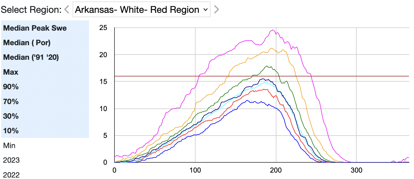
{{group  changeEntries=true changeEntriesLabel="Select Region"
firstEntry="93198426-f87d-40e6-b206-43b25ad1d4fa"
}}
<table width=100%><tr valign=top><td width=1%>
{{display_fieldslist width=150px
entry=93198426-f87d-40e6-b206-43b25ad1d4fa
fields="#41,#42,#43,#44,#45,#46,#47,#48,#49,#50"
...
}}
</td><td>
{{display_linechart
entry=93198426-f87d-40e6-b206-43b25ad1d4fa
fields="#41,#42,#43,#44,#45,#46,#47,#48,#49,#50"
...
}}
</tr></table>
The above lists the entries in a menu. Alternatively you can display the entries in a map
or in a timeline.